Illustrative service-fit completion
Baseline: 51%
+32 percentage points
Web / Case 03
A fictional service website that connects a clear scope, evidence-rich work and an honest inquiry handoff.
The original studio concept led with abstract statements and a long gallery. A visitor could see visual quality but struggled to understand which service fit, what the studio delivered and how to start a useful conversation.
Write the service choices and inquiry questions first. Connect each service to a complete case study, make the next step explicit and test the actual narrow layout with keyboard navigation.
A visitor should understand the service decision before seeing a collection of images. The fictional walkthrough frames this content problem.
Sources: relay-study
Full cases describe constraints, decisions and source boundaries. They avoid implying that visual polish alone proves effectiveness.
Sources: relay-study, relay-pilot
A static prototype validates the fields and creates a contact draft. It should never claim that an email was delivered without a connected and tested backend.
Sources: relay-study
Original interface studies illustrating the reviewed decisions. They are not customer screenshots.
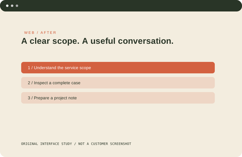
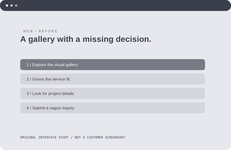
Before: Broad claims and project tiles leave the service choice unclear. After: Service context leads to full evidence-rich cases and a contact draft.
Baseline: 51%
+32 percentage points
Baseline: 3.2min
-50.00% relative change
All numbers in this fictional example are illustrative; they are not evidence of real uplift.
A website becomes more convincing when the visitor can trace a service promise into a concrete case and a realistic next step. Content structure did more work than decorative density.
Replace the fictional work with permitted sources, connect a reviewed inquiry backend and test completion with a real audience before reporting results.