Illustrative task completion
Baseline: 62%
+22 percentage points
Product / Case 01
A fictional transit pass flow that brings route choice, fare clarity and a useful next step into one considered sequence.
A first-time rider must choose a route, understand the fare and activate a pass while standing in a busy station. The original concept separated these decisions across several competing screens.
Map the first-ride decision before drawing components. Separate the rider's route question from account setup, compare two low-fidelity flows and design a small handoff around the selected sequence.
The supplied fictional walkthrough suggests that the next useful decision is where the rider is going, not which account field they should fill in.
Sources: transit-study
Show the assumed price and validity window next to the selected route. Operator policy must be reviewed before using this in a real ticket flow.
Sources: transit-study
Make the difference between selecting a pass and activating it explicit. The illustrative pilot values below exercise the result export, not a real measured claim.
Sources: transit-pilot
Original interface studies illustrating the reviewed decisions. They are not customer screenshots.
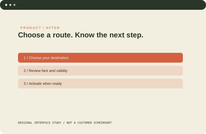
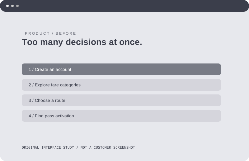
Before: Account setup competes with route choice and pass rules. After: A route-first sequence keeps fare and activation together.
Baseline: 62%
+22 percentage points
Baseline: 4.5min
-37.78% relative change
All numbers in this fictional example are illustrative; they are not evidence of real uplift.
A short flow can still hide an important decision. The useful unit of design was a route, a policy explanation and an activation state, not the number of screens alone.
Review fare policy with a real operator and test the route-first concept with permitted participants before making any effectiveness claim.