Illustrative label comprehension
Baseline: 58%
+23 percentage points
Brand / Case 02
A fictional pantry identity and shelf system that makes ingredients, quantity and a first shopping step easier to compare.
The proposed pantry mixes an expressive brand voice with practical dietary and quantity information. The challenge is to keep a warm identity while making the information people need to decide visible.
Start with the shopping questions, define an information hierarchy and carry it across shelf labels, a welcome card and a simple service page. Compare the language before styling the final system.
Keep ingredients and the unit price ahead of expressive copy. The fictional source illustrates the design question but is not evidence about real shoppers.
Sources: pantry-study
A consistent order lets the visitor compare alternatives without learning a new layout for every item.
Sources: pantry-study
A welcome card explains how to start and where to ask for help. The illustrative comprehension values are explicitly fictional.
Sources: pantry-pilot
Original interface studies illustrating the reviewed decisions. They are not customer screenshots.
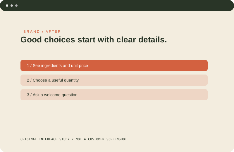
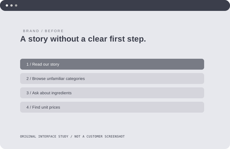
Before: Expressive headings hide ingredients and quantity details. After: A repeatable shopping pattern puts practical information first.
Baseline: 58%
+23 percentage points
Baseline: 47%
+32 percentage points
All numbers in this fictional example are illustrative; they are not evidence of real uplift.
A friendly voice is more useful when it leaves room for precise information. The brand can be recognizable without making every label an advertising headline.
Verify supplier information, review accessibility in the actual store and establish a measured baseline before testing the new labels.